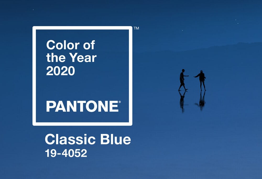
Pantone released their 2020 Color of the Year, and it’s much more subdued than recent shades we’ve seen prior. This year’s pick is ‘Classic Blue’, a hue somewhat between navy and powder blue — and great for decorating with at home. Here are a few ideas on how to use this color around your house in style.
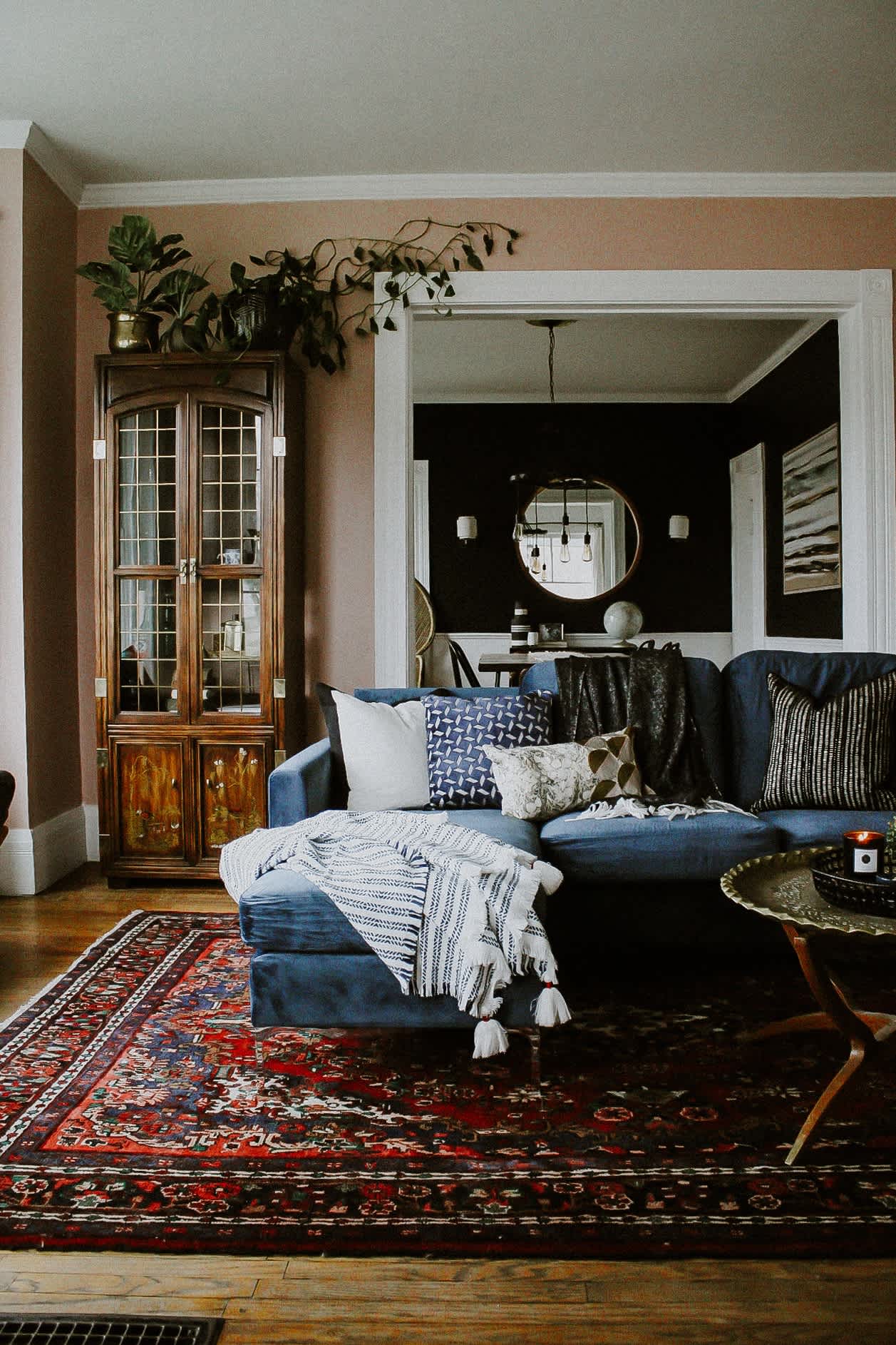
Pop of Blue
Even in a home with warm tones, a pop of Classic Blue can go a long way and add the perfect contrast to your otherwise copasetic palette. Our favorite way to incorporate this shade into your home? A pop of blue in the living area — Especially when that pop of color is the couch!
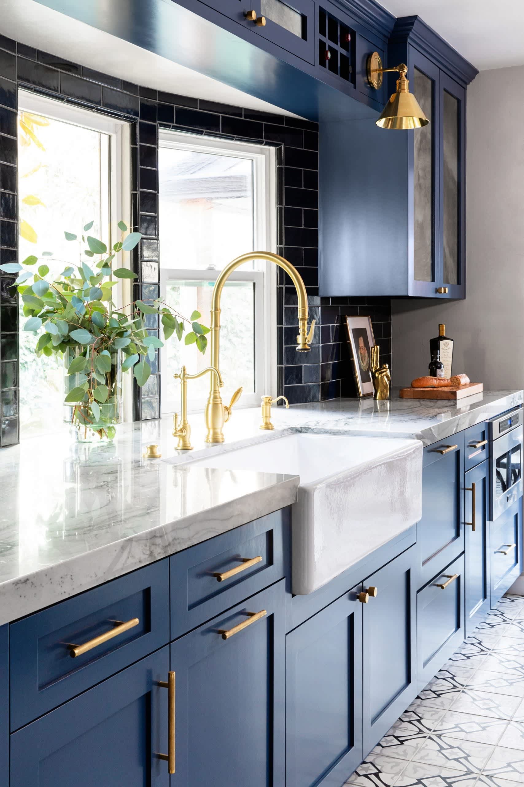
Gold Hardware
An easy way to add a chic touch to your kitchen is with a fresh coat of paint on the cabinets. Try painting them Classic Blue this year, and further updating the space with gold hardware. It contrasts perfectly with the cool color and will elevate the look and feel of your kitchen.
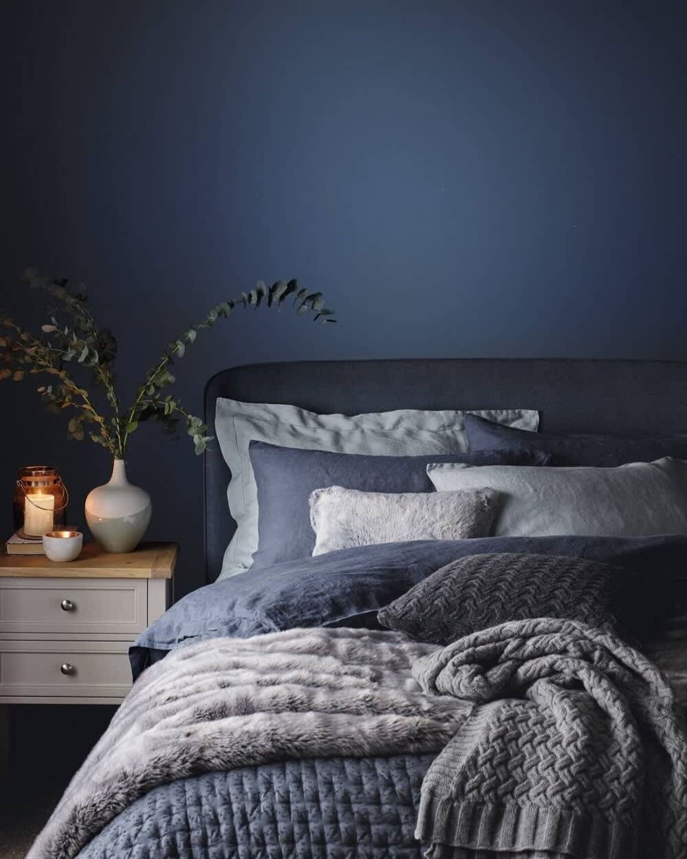
Layered Shades
Even though Classic Blue is a cool color, there are countless ways to create a homey warmth with the shade. Try layering Classic Blue with navy and powder blue textiles, natural fibers, and understated greenery.
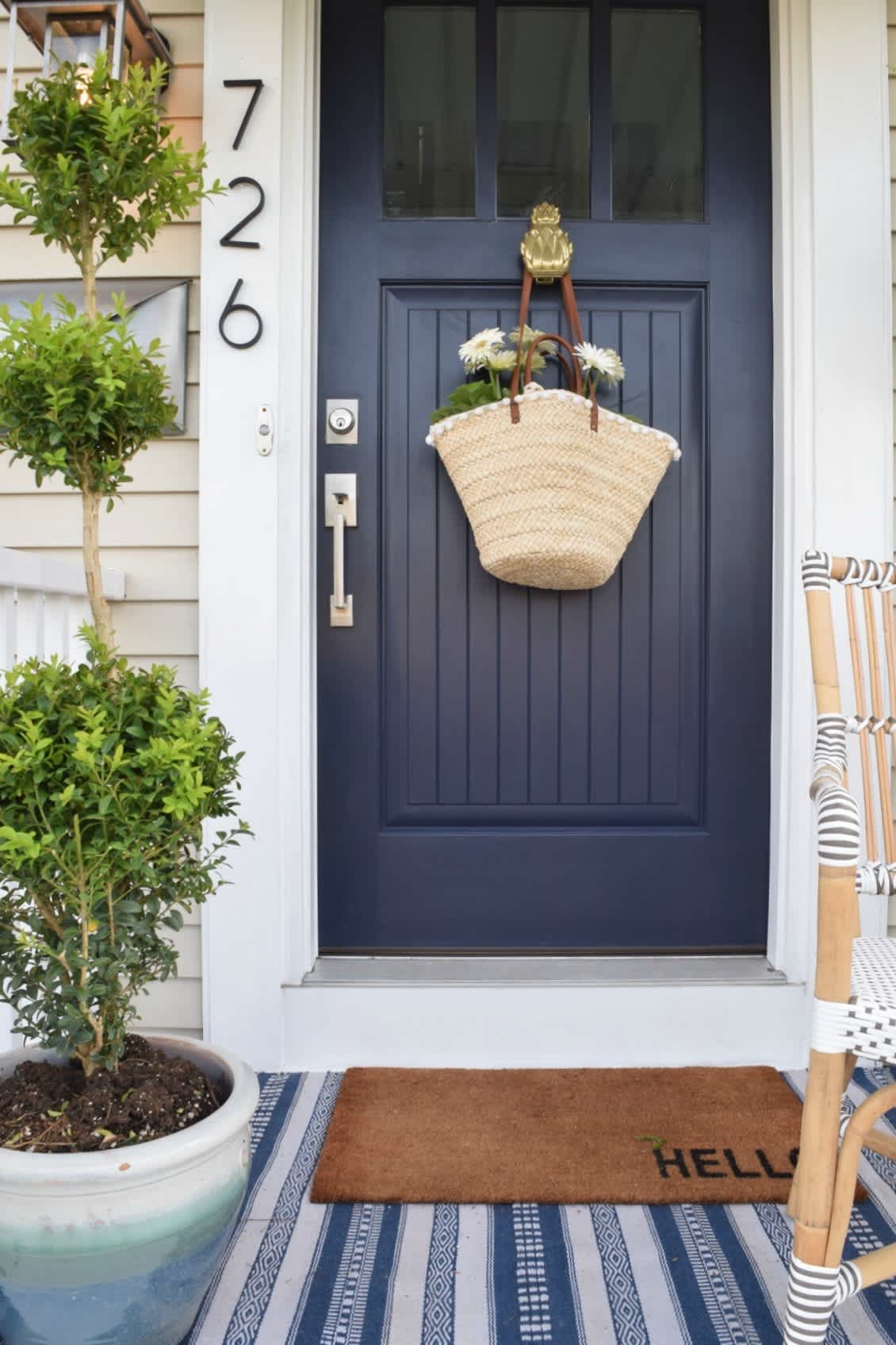
Curb Appeal
As long as your HOA isn’t opposed to residents painting their front doors, try refinishing it with a fresh coat of blue paint. Not only will it add a touch of style to the outside of your home, but it will also boost curb appeal.
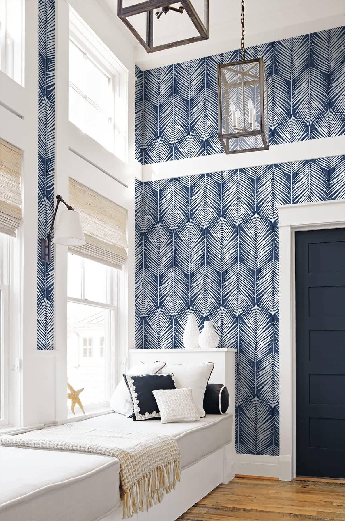
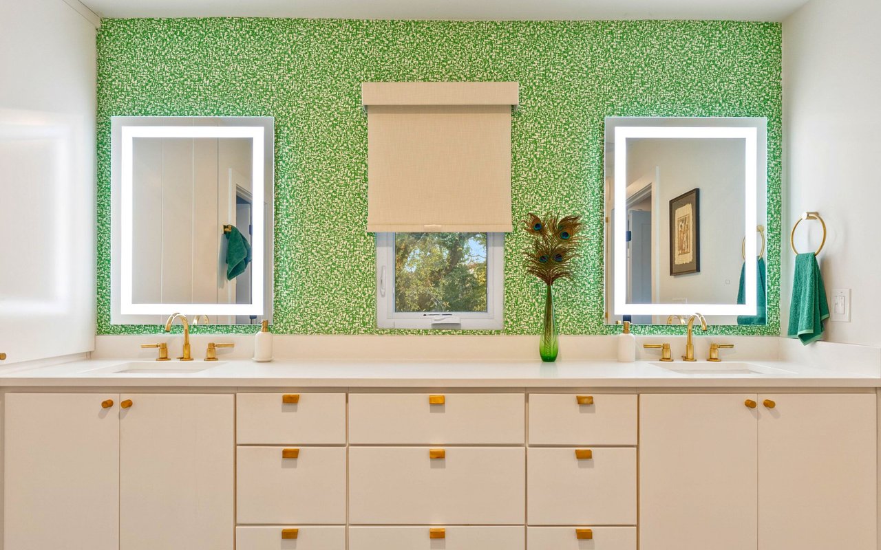
Statement Wallpaper
If you’re not convinced that Classic Blue is for you, try a removable wallpaper before committing to the color. With an easy application, this is the perfect way to test the waters without investing significant money or creating permanent changes. Consider placing it in a bathroom, nook, or second living space.