Have you ever brought a collection of new purchases home that you SURELY thought would work in your space, but when you put them all together, something seemed off? Or, alternatively, have you ever looked at a designer’s space and thought, how did they know to put those items together?
Yes, designers often just have a knack for it. They’ve got a good eye, and some, a good education in color theory and textiles to back them up. Still, I’ve always thought that there are parts of design that are formulaic. Objectively, there are certain design “rules” that if you learn and follow, you will likely get a good outcome. I put rules in quotation marks because I don’t really think there are hard rules to design, and if there are, they can be bent and manipulated.
Today, I’m talking about the design “rule” of balance—more specifically, dimension and symmetry. I touched on this on the blog before, but I thought it really deserved its own post because 1. there is so much to cover on it and 2. no matter your personal home style, dimension and symmetry will always play a vital role in making your space flow.
Figuring it Out
I’d like to disclaim that while I feel like I have an eye for these things, I also know that figuring out the formula for landing a balanced look every time has taken some trial and error.
At Vintage Fresh, we’re serial re-arrangers. We’re always moving things around and trying different looks. Building a balanced space is something I’ve personally mastered through practice in my shop and my own home. It is not something I always get right on the first try, and sometimes, I am surprised by what works and what doesn’t. As I said, no hard rules.
The practices and advice I’m about to lay out have, however, helped me hone my skills for arranging vignettes, shelfies, and larger spaces, and do so more efficiently.
Measurements Matter
I will say that a seasoned designer can probably sense if the size is right, but there’s always a risk. Eye-balling sometimes just doesn’t cut it, and when it comes to designing an entire space or even a small vignette, measurements play a crucial role.
The importance of measuring often becomes painfully obvious when you get furniture that is too big for a room and it looks clunky and claustrophobic. Other times, it’s because you went too small. If you have too many small items lined up with no dimension, you might find it looks cluttered yet empty at the same time.
I find the best way to combat these conundrums is to measure your space and stick to your proportions. For bigger pieces like furniture, it’s important to remember that the first piece you buy sets the stage for the size of every other large piece you buy for that room. When purchasing smaller pieces like accents and lighting, it’s quite the opposite. You want a mixture of sizes, so you can layer and draw lines of symmetry between them. With accents, it’s important to consider height, depth, and how the pieces will occupy the space and relate to one another.
If you don’t have the luxury of taking something home for a test ride or you’re trying to save yourself some hassle, it’s always better to measure and tape out the space to see how the proportions work. You may not get the perfect piece on the first try (maybe the pattern or color is off), but getting the correct size right off the bat is a good place to start.
Adding Layers
When a room or design falls flat, it often means that there aren’t enough dimensions or layers. Experimenting with colors and patterns can help, but if you lean toward more minimal decor and color palettes, introducing new textures and layering different pieces that share a similar palette can make all the difference.
For example, the designed vignette below by Carol Estes works for a few reasons. While at first glance this is an asymmetrical look, there are a couple lines of symmetry that help anchor it.
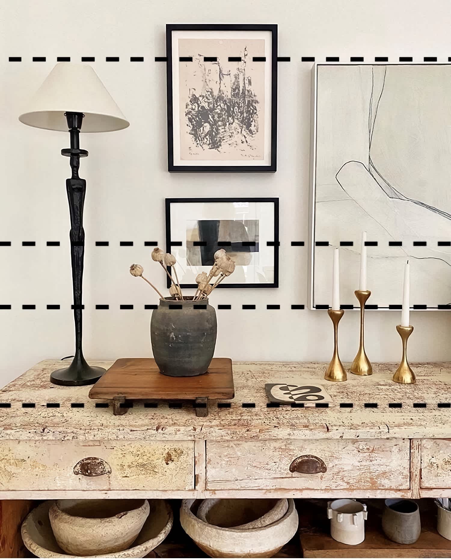
Sticking to a color palette of neutral hues and blacks, Carol adds different textures and layers them (i.e. the primitive vase on the wooden stand, the brass candlesticks, and the iron lamp) to create a cohesive look that is far from boring. If you’re finding that your layers are looking like a hodgepodge, I recommend you come back to symmetry. Take everything off the shelf or mantel, and start over. Start creating some symmetrical lines, and then add layers to create more dimension between them.
Don’t Aim for Perfect
I’ll end with building a balanced home doesn’t mean you have to start from the ground up to make it “perfect”. I’m a true believer that if you’re working with a challenging, imperfect space, you will arguably become more skillful in the art of balance because you will have to innovate new ways to make it work. To me, building a balanced home means making the most of imperfections. It means working with what you have on hand, making changes when possible, and making the most of what you can’t change.
If you’re facing a design challenge or want to ask a design question, give us a shout! We are always down to talk design.